Wednesday, 22 February 2017

Reflection Post: Light Effect

Light Effect


I needed to create a light effect for my teleportation, but I was not sure how to do this in After Effects. Instead of attempting something difficult, I drew from my experience with Adobe Animate, and used a simple shape layer to create the bubble, lowered the opacity until it was semi-transparent, and then applied a similar fractal effect to the one applied to my actor. Then I used a glow effect that, when combined with the fractal noise effect, made the bubble look less plain and more like it belonged in the scene.

bubble without effects applied

bubble with fractal noise and vector blur applied


bubble with glow applied

Reflection Post: Fade Effect

Fade Effect


Another problem was getting my actor to fade in and out of the scene. I did not want her to sudden appear and disappear, so I needed some way to get the footage to fade. This was where my researched tutorials became useful. Following a tutorial on simple teleportation effects, I applied a fractal noise effect with a vector blur to a black solid layer, which I used to make my actor fade in and out of the scene using a luma matt and keyframes.

fractal noise with vector blur applied

fade effect applied using luma matt

Reflection Post: Removing Backgrounds

Removing Background


The biggest challenge that I faced was effectively removing the background from my actor footage. Initially I planned to do this using the rotoscope brush, however I made some mistakes when I filmed the footage. Firstly I filmed it on quite a busy background. This meant that the rotoscope brush kept including pieces of my background, and the edges were very blurry. Secondly I filmed it inside, which gave me inconsistencies in the lighting between my background and footage. To fix these issues, I refilmed those clips using a rudimentary blue-screen, in an outdoor setting. This meant that I could use chroma-keying to remove the background, instead of rotoscoping.

However I still had some problems in making sure that my chroma-key removed the background cleanly. I found that some parts of the footage would be clean, while others would flicker, such as the hat. To solve this problem I layered duplicates of the same footage over each other and masked sections to have different settings applied. This allowed me to cleanly remove the background from the entire clip without some parts being lost or flickering around the edges.

Reflection Post: Assignment 3

I am, for the most part, happy with the end result of my project. There are some things that I could have done better, such as the shadow beneath my actor's feet. I almost forgot to add it and I am not entirely sure whether it is the right kind of shadow for the light in the scene. I would have liked to spend more time getting that detail right. I would have liked to try something slightly more visually interesting than a simple teleport across the screen, however I am happier with this version than the my original ideas set out in the animatic and storyboard.

I am particularly happy with the blue bubble that appears around the actor. I think that it enhances the science fiction feel of the scene and does not end up looking too amateur. I am also fairly pleased with the colour-grading. I was aiming to make the scene look gritty and serious, almost like a post-apocalyptic world.

Another element I would have like to do better was my actor. For lack of other people, I had to use myself, which made filming quite difficult. The footage that I ended up using was my second attempt, where I used a rudimentary blue-screen to remove the background. This was easier than my original plan of rotoscoping the footage, however it needed quite a lot of fiddling to make it smooth. I would have like to have spent more time on producing higher quality footage and less time on trying to cleanly remove the background.

At the beginning of this project I was unsure of what I would be expected to do and my ability to produce a decent video. I did find parts of the past three assignments rather difficult, especially the planning stages when I did not have a clear idea of what I wanted to produce. However, I feel as though I have learnt a lot during this unit and have adequately put that knowledge into practice in this video.

A3 - VFX Breakdown


Here is the breakdown of the visual effects used in my final video. I hope that I have effectively shown what effects and techniques were used. I have broken down my video in the different stages of production, from the raw footage before I removed the background, to the final additions of the fade and light effects. 

A3 - Final Video


Here is my final video, all rendered and uploaded. Since my last draft, I have completely re-filmed the clips of my actor and used chroma-keying to remove the background instead of rotoscoping as I used previously. This solved the issues that I was experiencing with flickering edges. I have also tweaked the audio to remove a slight glitch and made sure that my actor is properly colour-matched to the background.

Overall I am very pleased with the result. Since I reworked the action in my video, it has become more visually interesting than my animatic indicated, and I think that the timing works fairly well. While most elements fit together rather well, I am not entirely happy with the shadow I added. I would have liked to spend more time figuring out exactly how that shadow should have fallen, as I am not entirely convinced that it is accurate or believable. However, that is a small detail and I am really quite pleased with my video.

Thursday, 16 February 2017

A3: Refinement Critique

Over the past couple of days I have had to make some intensive changes to some elements of my project, including some of the source film. Originally I filmed and rotoscoped a section of film, then laid it over a static backplate. However I encountered some problems with producing a smooth rotoscope on the film I had, because it was filmed on a busy background and there was insufficient contrast between my actor and objects behind her. This result in flickering edges and parts of my actor randomly changing shape. To fix this problem, I re-filmed the entire clip using a rudimentary blue screen and clothing that contrasted better with the background. Instead of rotoscoping this section, I used chroma-keying to remove the blue, which has for the most part fixed the flickering edges. Unfortunately the hat that my actor is wearing does flicker a little bit, but I may be able to fix this with a little fiddling. Other than that, I am fairly happy with the result of my actor clip.

My original narrative was, as my tutor pointed out, rather boring, so I have made a change to the action that happens. Originally I was just going to have my actor slowly fade into the scene. Someone, probably my tutor, suggested having my actor disappear from one part of the scene and reappear in another, so that is what I have done. The action is rather more interesting, although the 15 second time limit constrains what I can do. I would have like to make it more obvious that my actor has teleported somewhere other than this scene, but I really did not have the time to re-film parts of the video again to explore that aspect.

Those are the main things that I have changed from my original plan. However there are a few things that need tweaking in the video before it will be ready to submit. I want to adjust the colour of my actor clips to make them better match the background. They are not too dissimilar, but with a little work they can match better. 

I also need to work on the audio. There is currently a quite obvious glitch in the audio that I have imported, and I am not sure that it matches up to the action as well as it could. So I will have to take another look at the audio track and fix the glitch and I may also work on the balance between the wind sound effect and the teleport sound effect.

Other than that, I just want to check the timing of the action to make sure that it works properly and that the teleportation does not take too long or have too short a break in between the actor disappearing and reappearing. 

Overall, I am happy with how this project is shaping up. I did get rather behind on it, and was further delayed by the need to re-film some parts. However, these issues are behind me and I feel as though I have reached the stage at which I can focus on polishing my project.

Saturday, 11 February 2017

A3: Work in Progress


This is my work in progress video. I'm fairly happy with the colour grading, which I used to make everything de-saturated and almost greyscale. There's a slight problem at the moment with the audio, which is just a glitch with the sound file. My biggest problem at the moment is the rotoscoping. I'm having some significant issues with flickering edges. I'm going to work on smoothing that out further, but on the whole, I'm happy with the progress that I've made.

Monday, 23 January 2017

Assignment 2 Visual Tests


This is the original picture, before I did any colour grading. It almost had the right tone, but I wanted something a little greyer. 


This is my colour graded version of the image. I altered the levels of red, blue and green, and dropped the saturation quite a bit to create an almost grey image. It is supposed to look a little post-apocalyptic.


This is a test for the teleportation effect I will use in my project, done with the help of one of my researched tutorials. I'm happy with the result, although I still have to figure how to combine this effect with my adjustment layers. 

Project Resources


This tutorial shows me a couple of simple teleportation effects that I can use in my own project, which will allow me to achieve a decent effect within the time available. I like the first effect better for my own project, but I'm willing to try both.

https://www.lynda.com/After-Effects-tutorials/Applying-enhancements/166363/174050-4.html?autoplay=true

This is a link to one of the tutorials we watched as part of our weekly studies. It focuses on colour correction and grading. This will be invaluable in allowing me to create a better looking video.


Another tutorial about colour grading/correction. This just gives me a slightly more in depth look at colour grading in After Effects.

Assignment 2 Animatic


This is my animatic for assignment 2. I've added a couple of audio tracks over the top, which I feel fit fairly well with my animatic timing. For the most part I was only a second or so off on the timing I included in my storyboard, which seems to have been a decent start for this project.

Assignment 2 Storyboard


This is my draft storyboard. I'm not sure about how it will translate to an animatic due to the lack of any movement from the actor, but hopefully this is on the right track. 

Friday, 6 January 2017

Ideation and Concept Developement: Project Idea 3

What is the central theme/topic of the video?

The central theme/topic of this video will be teleportation, similar to ones in sci-fi movies such as Star Trek.


What is the action that will unfold in the video?

The first thing that the audience will see is a empty room/area. Then a person will appear from nowhere, accompanied by some kind of glowing lights.


What specific kinds of media do you imagine?

I think this project needs a mixture of photos and film for the action. Then I think that, to polish the video, I need some kind of After Effects created light effect and a sound effect to accompany the lights and teleportation.


What would be needed in order to execute the video?

To make this video I will need some green-screened footage of a person, some images for the background and some kind of light effect, probably created inside of After Effects.


What do you imagine the context/action for this video to be?

This clip would be part of a sci-fi movie similar to Star Trek.


Who is the expected target audience?

I think that the target audience of this video would be teens/adults interested in sci-fi movies, the kind of people who enjoy Star Trek, Star Wars and superhero movies.


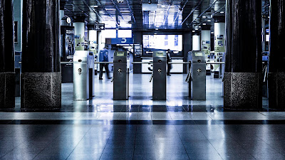
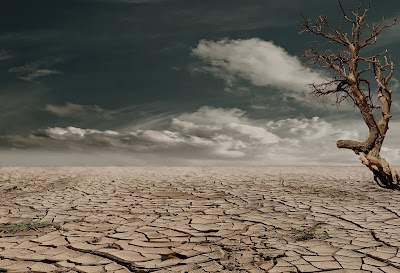
These are a couple of types of environments that I am considering for the location of my teleporation scene:

Train Station: https://static.pexels.com/photos/121521/pexels-photo-121521.jpeg

Desert: https://static.pexels.com/photos/60013/desert-drought-dehydrated-clay-soil-60013.jpeg


Ideation and Concept Development: Project Idea 2

What is the central theme/topic of the video?

This idea centres around a cloud of butterflies emerging from a box. I haven't really come up with a more complicated concept than that.


What is the action that will unfold in the video?

The audience will see a box sitting on a doorstep. The box will shake a couple of times before settling. Then, after a couple of seconds the top will burst open and a cloud of butterflies will emerge and fill the sky.

What specific kinds of media do you imagine?

I image this video being mostly animated, probably using Adobe Animate. The individual elements would be digitally created.

What would be needed in order to execute the video?

I would use Adobe Animate to create the individual elements of this video, and then use After Effects to put it together and add some colour grading and special effects to polish it.


What do you imagine the context/action for this video to be?

I imagine that this video would be part of an short animated film, lasting no more than a minute or two. It would just be a snippet of interesting action that does not need to fit into a larger plot.


Who is the expected target audience?

I think that the target audience of this video would be people browsing videos on video sharing sites such as YouTube or Vimeo.


These are a couple of videos that gave me some inspiration as to what I could do myself:


Thursday, 5 January 2017

Ideation and Concept Development: Project Idea 1

What is the central theme/topic of the video?

This video is based around storytelling. It is inspired by the storybook openings of the old Disney princess movies, which were introduced by a narrator while on screen a book magically opens.


What is the action that will unfold in the video?

The audience will see a large closed storybook sitting on a table in the middle of a room that looks as though it belongs in a castle. This shot would be fairly wide. Then the camera will move closer and tilt so that it is looking down on the book. At this point the book will slowly open to the first page.


What specific kinds of media do you imagine?

I imagine this video using a combination of photos to create a room in a castle. I think that it would help reinforce the association with storytelling if I also used a recording of a narrator introducing the story, which would be like a voice-over. While I am not sure about the difficulty of achieving this, I would also like to experiment with adding illustrations to the pages of the book.


What would be needed in order to execute the video?

This video would require footage of a book opening, some photos to be combined into a backplate for the scene, a recording of a narrator's voice to introduce the story and, possibly, some text on the first page of the book.


What do you imagine the context/action for this video to be?

This video would be the introduction of a movie based off a fairy tale.


Who is the expected target audience?

My target audience would like children, parents and anyone who enjoys watching the old Disney princess movies.


Library - https://stocksnap.io/photo/XAEKYP9IIZ

old book - https://static.pexels.com/photos/37035/pexels-photo.jpg

row of books - https://static.pexels.com/photos/34592/pexels-photo.jpg

stone room - https://static.pexels.com/photos/27974/pexels-photo-27974.jpg
Here's a link to a Shutterstock video of a book opening: http://www.shutterstock.com/video/clip-4503944?language=en&utm_medium=Affiliate&utm_campaign=Eezy%20Inc&utm_source=38919&irgwc=1

Research and Analysis: Creative/Conceptual Video 3


This video matches quite closely with one of my video ideas. Although I was originally inspired by the old Disney princess movies that started with a storybook, this short animation has quite a few of the same elements. This book was created using animation, but I think that it could be achieved fairly easily using a real book and a green screen or some rotoscoping to separate it from its background. This example works well because of how the narrative fits into the pages and the interest created from the moving pictures. That is an idea that it would be interesting to try for myself, although I am not sure how difficult it would be. I think that moving pictures themselves could have been more interesting and fitted better with slightly stylized book, however. I like the glow that surrounds the book and would like to incorporate that into my own project, if I choose this idea. I also like the audio, which enhances the feeling of the video. 

Wednesday, 4 January 2017

Research and Analysis: Narrative/Film Technique Video 3


I like the creative way that the narrative unfolds here. While the theme of this video is simply that using Voya is beneficial, it does so in a way that is attractive and creative. To give people the idea that Voya is the right choice for them, the world is portrayed as a happy and bright place. This idea is supported by the colour grading used which is light and bright. Most of the videos that I have chosen possess this kind of lighting, which is something that I would like to see in my own project. The other inspiring part of this is the rabbits, which are both cute and clever. They were likely created using 3D software, which is a little beyond the scope of my project. However they are a clever way to create the atmosphere that the ad requires. I'd like to use the same creative approach to the narrative of my own project and also use a similar quality of colour grading.

Research and Analysis: Technical Video 3

LG - Ciclope with subtitles from Tiago Dias on Vimeo.

This video is interesting because of the alterations made to some of the characters faces. The tracked face is done quite well, and it wasn't until I really looked that I started picking up the tiny details and any imperfections to the skin. I did find the narrative a little boring and not very convincing. There was no explanation of the two eyes are better than one theme until the very end and the dialogue with the patient seemed pointless. The video appears to use tracking to replace the two eyes with one for some characters. Other than that, I would guess that some green screen was used for the phone and some colour grading to achieve that light smooth look across video. While I do not think that I will be using tracking in the same way, it is interesting to see what can be done with this technique. I am interested in the ability to add images to a flat surface such as the phone screen which could be quite powerful. 

Research and Analysis: Creative/Conceptual Video 2

Laline from Geronimo post&design on Vimeo.

I like the visual style of this video. The lighting is beautiful and creates a truly magical atmosphere, which is heightened by the almost steampunk style of the instrument and surrounding environment. This example works well because of how all the elements are well matched in style and the colour grading further helps ties together all the pieces. I found a breakdown of how this video was made, which allows me to understand the techniques better than if I had to guess. The acting was all done on green screen, then the world was constructed using images, colour grading, and some special effects. These show me how powerful green screen can be in constructing environments that could not exist in the real world, and how the results can appear seamless despite almost every part of this video being created in the compositing stage. I love the colour grading on this video and it is something that I would like to replicate in my own project. The narrative is clear and quite creative, which is something else that I want in my work. 

Research and Analysis: Technical Video 2


Through watching a breakdown of the visual effects used in Mezzo "Leap", I know that the entire of this video was filmed using a green screen. The resulting footage was combined with images, special effects and some 3D models to build the environment. This example works well because a perfect simulation of reality was not required. Trees might not actually look and behave like they do in this video, but for the purposes of creating a pretty and exciting place where people are happy, it creates the right visual effect. The colour grading on this project makes everything bright and all the colour pop which contributes to the perfect world that they have built. I like that colour grading and I also like the fluid narrative of this video which follows the actions of the actors. Those are the elements of this video that I would like to see in my project.

Tuesday, 3 January 2017

Research and Analysis: Creative/Conceptual Video 1


This video has a concept similar to one of my ideas. The animation is fairly basic and there appears to have been little thought put into the composition of this video, but the mass of butterflies are what drew me to this video. My idea requires a little more compositing, an actual background and some more thought to the composition, but this does give me some ideas about the style of the butterflies that I would create.

Research and Analysis: Technical Video 1

Legs on Fire from El Diablo on Vimeo.

This is an interesting example of colour grading. The colourful glows around the room give this video the proper mad scientist atmosphere. I like the cartoon style of this video combined with the clever compositing to add the mist and the colourful light. I also thought that the narrative of this video was quite clear and well portrayed. As I am considering using 2D animation in my own work, this provides me with some interesting techniques. I would not have thought of separating out all the separate part of an animation and compositing them at the end. This does allow for more flexible colour grading. I like the use of 2D animation here and the way that it combines with clever colour grading to create atmosphere. I also noticed some slight blurring on some sections, which tricks the eye into thinking that there is some depth to the video, which is something I'd like my own project to have.


Legs on Fire micro breakdown from El Diablo on Vimeo.

Research and Analysis: Narrative/Film Technique Video 2

Popsy - TV Spot from Oscar Barrera on Vimeo.


I like the cutout style of this ad. It gives the video a interesting quirky appearance. The layering of elements for the backplate is interesting and I would definitely like to try something like that. I also quite liked the light that they used, although the second part of this ad does seem a little too bright and golden compared to the first part. The colour grading and layered backplate work really well, as does the clear narrative. However I feel like the different elements could have been better matched. The clouds are clearly cutouts, but the buildings look more like models, and the ice cream stand at the end is done in a completely different style again. This is an area which cold have been better. I would like to replicate the cutout style, but make all the elements in the same style, unlike this example. I also would like to replicate the bright light colour grading that has been used here. Because this is an ad in another language, the audio really isn't helpful to me. If I was to do something in this style I would choose a playful piece of music to match the style of the backplate. 

Monday, 2 January 2017

Research and Analysis: Narrative/Film Technique Video 1


I like the opening example of this compositing reel, where everything was blocked out in bright colours. It reminds me of the iPod ads, but is more fluid. I also like how the video is in sync with the audio. While I'm not sure exactly what techniques were shown I know that they had to heavily colour grade some parts, like the silhouettes. This video likely required some rotoscoping to mask out anything around the shapes and separate the different coloured areas. The silhouette shapes work effectively because they are so fluid. They flow easily from one image to another, which guides the eye and gives it a creative flair. I do not like how these images have no relation to each other. They don't follow a narrative or theme. On thing that makes this example really work is how the video follows the audio. They are really well matched and the funky music makes the images seem more dynamic. I am inspired by the fluidity of this example. I like how the silhouette clip, and indeed most of the examples on this reel, have are dynamic and colourful. Nothing is static and nothing is particularly realistic, but the colour and the flow attract the eye and provide interest.